 Converter
CSS Unit Converter
Convert CSS sizing units such as px, rem, em, and pt for responsive typography, design tokens, and implementation QA.
Keeps root-font-size assumptions visible so design and engineering teams can compare computed values safely.
What This Category Covers
- PX, REM, EM, and PT unit conversion
- Root font-size and responsive typography checks
- Design-token migration workflows
- Computed CSS value review
- Web typography implementation support
Common Use Cases
- Translate legacy px values into rem for scalable design systems.
- Check rem and em values as pixels during browser and design QA.
- Compare px, rem, em, and pt before moving typography specs into CSS.
Quick Reference
| Task | Recommended Tool | Why It Helps |
|---|---|---|
| Responsive font scaling | PX to REM | Maps fixed values into root-relative CSS tokens. |
| Design QA checks | REM to PX | Shows how rem values render at the current root size. |
| Component-local scaling | PX to EM | Checks values that should follow a component font context. |
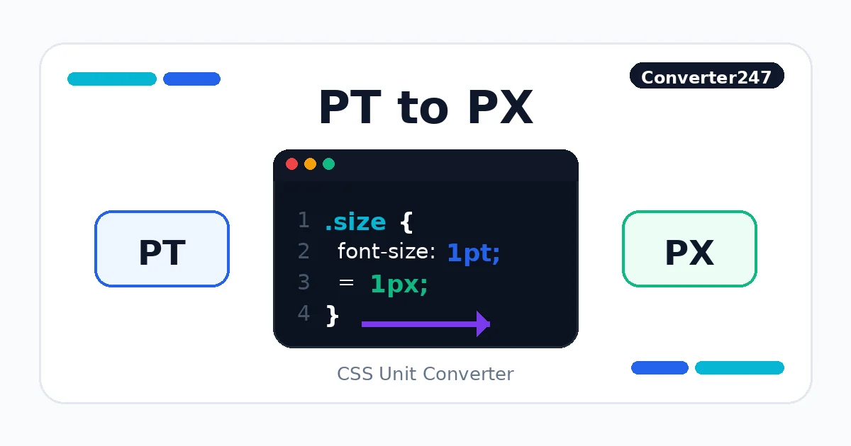
| Print to screen adjustments | PT to PX | Converts typography specs for web delivery. |
How CSS Unit Decisions Work
CSS unit conversion is useful when design values move between visual specs and implementation. PX values are fixed, while REM values depend on the root font size and EM values depend on the current element context.
Use px-to-rem and rem-to-px tools when auditing typography, spacing tokens, and component libraries. Use px-to-em and em-to-px when the value should follow a component font-size context rather than the root.
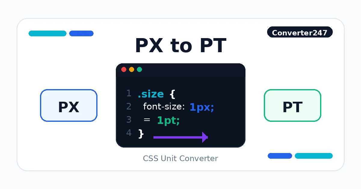
Do not convert every CSS value automatically. Hairline borders, raster assets, and tiny optical adjustments may stay in pixels, while typography and spacing systems often benefit from rem-based values. PT is usually a print-oriented unit, so treat pt-to-px and px-to-pt as handoff checks rather than a default web typography strategy.
CSS Unit Workflow Paths
Choose the unit family that matches the CSS decision you are making, then use the guide links when the root size, component context, or print-to-screen handoff needs more explanation.
Popular CSS Unit Converter
Search In Library →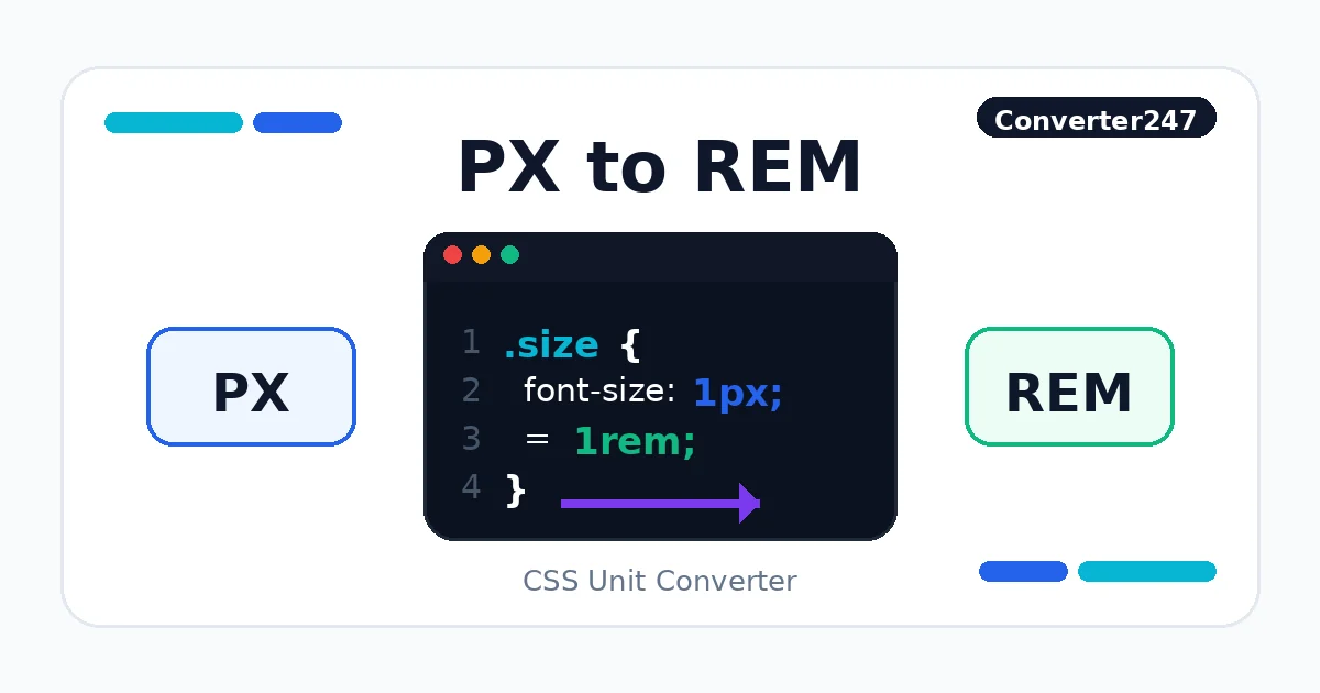 CSS
CSSPX to REM
CSS unit conversion for responsive UI.
 CSS
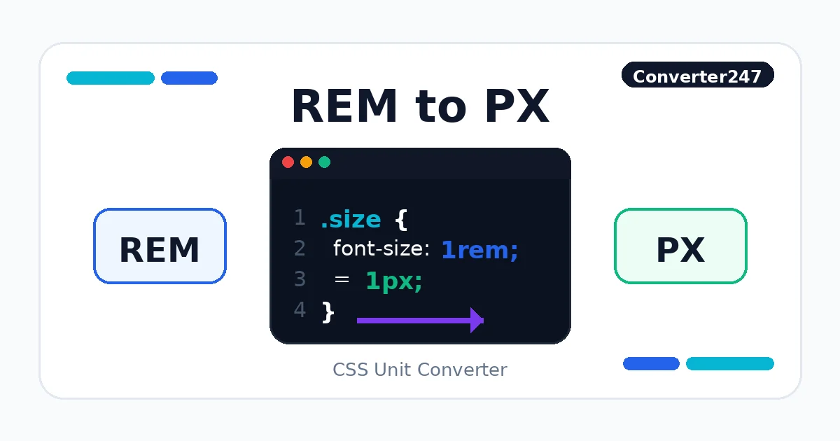
CSSREM to PX
CSS unit conversion for responsive UI.
 CSS
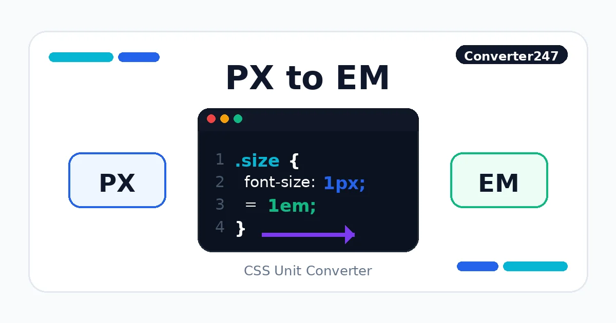
CSSPX to EM
CSS unit conversion for responsive UI.
 CSS
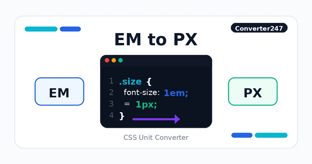
CSSEM to PX
CSS unit conversion for responsive UI.
 CSS
CSSPT to PX
CSS unit conversion for responsive UI.
 CSS
CSSPX to PT
CSS unit conversion for responsive UI.
Related Guides
These references explain PX, REM, EM, root font size, and unit choice so design tokens and typography are converted with the correct CSS context.
All 6 Tools In This Category
PX to REM
CSS unit conversion for responsive UI.
CSSREM to PX
CSS unit conversion for responsive UI.
CSSPX to EM
CSS unit conversion for responsive UI.
CSSEM to PX
CSS unit conversion for responsive UI.
CSSPT to PX
CSS unit conversion for responsive UI.
CSSPX to PT
CSS unit conversion for responsive UI.
Related Categories
CSS Unit Converter FAQ
REM values are relative to the root element font size, so the same rem value can render differently if the root size changes.
No. Use rem for scalable typography and spacing, but keep pixels for fixed visual details when exact rendering matters.
REM is based on the root font size. EM is based on the current element context, so nested components can change the computed value.